How to Achieve Balance in Your Artwork
We’ve talked quite a bit about how to make harmonious color combinations based on color theory and the color wheel. Today we’d like to branch out and look at some other visual elements that can boost your artwork beyond the use of color.

Balance is a design principle that refers to the distribution of visual elements (such as shapes, colors, space, and textures) and how they relate to each other in terms of their visual weight. That term “visual weight” sounds a bit complicated, so let’s take it back to the playground to explain.
Consider two children on a seesaw. To have a fun experience, the children on either side of the seesaw should be relatively the same size or weight. If one child is heavier than the other, the seesaw is unbalanced and it will continuously want to tip to the one side, creating an unpleasant experience for everyone involved. The same idea applies when working on two dimensional paper projects, such as scrapbook pages or cards.
We tend to strive, usually without thinking about it, to create artwork that is balanced. A balanced work, where the visual weight is distributed evenly, appears stable, is pleasing to look at, and makes the viewer feel comfortable. Work that is unbalanced does the opposite. Sometimes artists create unbalanced art on purpose, but that is pretty rare in scrapbooking and cardmaking.
So how do we apply this design principle to our craft?
There are a few different approaches to achieve balance in your artwork—and we brought examples! So far we’ve been alluding to probably the simplest approach, and that is something known as reflection symmetry, where one side mirrors the other (both kids on the seesaw are the same size). This is an easy way to achieve balance and doesn’t require too much consideration. Simply draw a line (hypothetically, you don’t really have to draw a line) down the middle of your work and then mirror what you create on one side on the other side. The line can be drawn vertically, horizontally, or even diagonally.

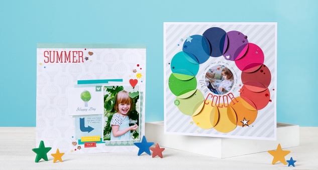
Radial balance is another type of symmetrical balance where the visual balanced is based on a circle (don’t worry, we won’t quiz you on these terms we’re throwing around—the principle matters more than the vocab  ). The design has a center and it extends from there. Daisies, a star, and the sun (when depicted with it’s rays) are all examples of shapes in radial balance. The page above is a beautiful example of one way you could use radial balance in your scrapbooking.
The downside to symmetrical balance is that it can sometimes come across as too simple, or boring, since both sides are visually the same. But there’s more, so keep reading!
Asymmetrical Balance
To have balanced artwork does not mean that all of the pieces on your scrapbook page or layout have to be the same size and laid out in perfect symmetry. Back to the seesaw—if you have a big kid that wants to play but don’t have a child of the same weight to balance him out on the other side, you create the weight by stacking two or three kids opposite the big kid. Another option would be to move the big kid closer to the center of the seesaw with just one smaller child on the opposite end to achieve balance where the two can play harmoniously.
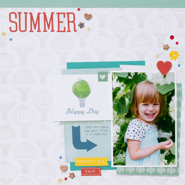
In art, if you have a large object on one side of your work it can be balanced with several smaller items on the other side. Or, instead of increasing the number of parts on your scrapbook page (because sometimes we don’t have them or just don’t want them), move the larger piece closer to the center and balance with the smaller elements on the opposite side.

Take a look at our asymmetrical page above. This page is asymmetrical because it has unequal visual weight on opposite ends. To balance it, our “heavier” elements were moved closer to the center and were countered with a handful of lighter elements on the other corner.
When done correctly, asymmetrical balance is more interesting to look at. It offers more visual variety and even has a more modern feel to it.
To determine whether or not your artwork is balanced, rely on your perception of it. No one area should draw your eye so much that you can’t see the others. Also, consider how it makes you feel. Do you like it? Is it comfortable to look at? Or do you sense that something is off?
Balance is the first of several basic design principles we will be discussing on this blog. Make sure to subscribe and to check back with us regularly to learn how to better use the elements of art in your artwork.
Recipes
12″ x 12″ Life In Color PageB1484 My Acrylix® Jennifer’s Hand Stamp Set, Z3353 Basics Fundamental Paper Packet, X5965 Ruby Cardstock, X5963 Poppy Cardstock, X5962 Goldrush Cardstock, Z5961 Saffron Cardstock, X5982 Canary Cardstock, X5981 Sweet Leaf Cardstock, X5970 Willow Cardstock, X5968 Lagoon Cardstock, X5967 Pacifica Cardstock, X5966 Pansy Cardstock, X5957 Sapphire Cardstock, X5974 Raspberry Cardstock, 1385 White Daisy Cardstock, Z2832 Pewter Exclusive Inks™ Stamp Pad, X7232C Fresh Air Complements, Z3355 Happy Moments Complements, Z3356 All-star Complements, Z4178 Central Park Sequins, Z4197 Central Park Alphabet, Z4177 Documented Dots, Z3090 Red Gems, Z3274 Clear Sparkles, Z1263 Bitty Sparkles, Z1979 Marvy® Uchida® LePen™ Journaling Pen, Z3290 Circuit® Flower Market Collection
Cricut® Shape:
Flower Market3″ Flower-2 <7> (p. 7, #MD389A5, cut 12)
Flower Market3″ Flower-2 <7> (p. 7, #MD389A5, cut 12)
12″ x 12″ Summer PageX7231B Central Park Paper Packet, X7232B Fresh Air Paper Packet, X5968 Lagoon Cardstock, 1385 White Daisy Cardstock, X7231C Central Park Complements, X7232C Fresh Air Complements, Z4185 Fresh Air Shapes, Z4178 Central Park Sequins, Z4197 Central Park Alphabet, Z1297 Edge Distresser, Z1979 Marvy® Uchida® LePen™ Journaling Pen


No comments:
Post a Comment
What did you think? Please leave a comment and make my day!