Design Principles: Rhythm & Movement
Many of us scrapbook with storytelling as our primary goal. Preserving stories is the main factor we keep in mind as we design pages, layouts, and albums. The story is what guides our photo placement and the order of events. Sometimes, we even go as far as labeling parts of our pages to help the viewer follow a specific path through our stories.
Today we’re going to discuss two design principles that will help your artwork do some of the storytelling for you. These two principles work together to organize different elements within your artwork in order to create a natural visual flow.
Rhythm is something that catches the viewer’s eye and continues to move it through the artwork. It is created through slight differences in a pattern and repetition of elements, and, just like in music, it can vary in pace depending on how heavy your patterns are and how often they repeat. Movement is the path that your eye takes through the art.

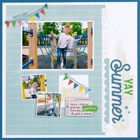
Can you spot the rhythm causing elements in our example scrapbook page above? There are several, so let’s talk through a few of them. First, take a look at those colorful pennant banners. There are two, both made up of equal-sized triangles and the same color scheme. As a pair, these two banners catch our eye and move our attention from the top left of the page to the center. Even each banner has its own rhythm because of the repetitive triangle shape.
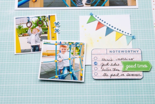
A second place we find rhythm in this piece is in the cluster of squares and rectangles made up of the two small photos, the white rectangle behind the lower banner, and the small journaling card.

They are all similar enough in shape and size to consider them a repetitive pattern. This rhythm generates a sense of movement in the lower middle section of the page.
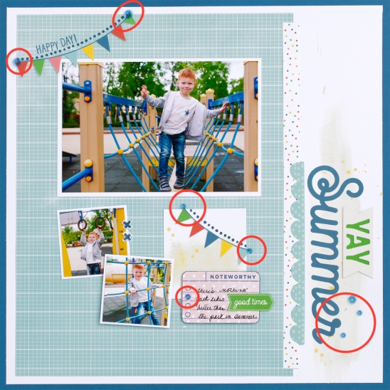
A third, subtle, way we created movement in our example is through the repetitive use of blue sequins.

We started out at the top left, moved to the middle, then across to the bottom right. Another place we see rhythm and movement in this one page is with the color yellow. From the banners, to the photos, and the paint washes, there are small accents of yellow carrying our attention from one place to the next.
These are just a few of the many ways rhythm is creating movement in this example piece. Now that you know what to look for, can you spot any more?
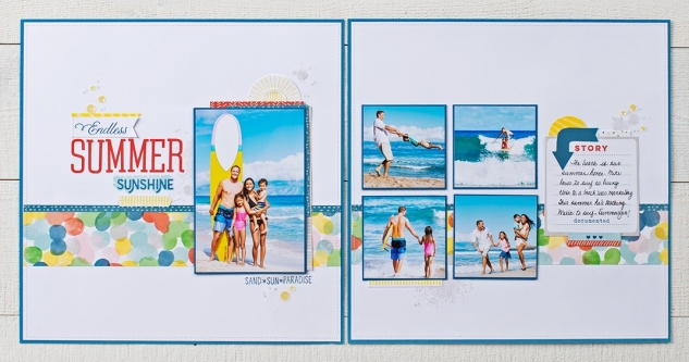
Most of you reading this blog naturally look at things from left to right, top to bottom. It’s how we’ve been trained to read the world around us. To keep with this natural rhythm we’ve all been subconsciously taught, keep it in mind as you create your artwork so that the finished product will look and feel pleasing to you and your audience. In the following two-page layout we use lines, shapes, color, and space to create rhythm and movement from one page to the other, following a left to right, top to bottom flow.

In the left page, where we will always know to begin, we are first drawn to the title for several reasons. One of which is because it is framed with yellow lines and accents.
From this highlighted title, the yellow rhythm continues to the surfboard in the 4 x 6 photo and then from one cluster of embellishments to the next until we reach the end (or right side) of the second page. Also creating rhythm and visually moving us along from left to right are the blue lines, blue photo mats, and blue arrow.
Creating rhythm and movement in artwork will take practice and patience to master. The first step in the process is to know that it is there. Make note of it in other people’s art and learn from it. Take what you see (and like) and incorporate it into your artwork as best you can. With practice it will eventually become second nature and you will be visually guiding others through your artwork and your stories intentionally and with purpose.


No comments:
Post a Comment
What did you think? Please leave a comment and make my day!